Chicago Sky Unveil New Logo

The Chicago Sky unveiled a new logo and color scheme today, marking the first time in franchise history the branding and identity has undergone a change since the team’s inception in 2006.
“The entire Sky organization is thrilled to share our new logo with the city of Chicago and our fans,” said Sky President and CEO Adam Fox. “This is an incredibly exciting time to be in for our franchise. We believe this new look is strong, modern, and refined; all traits that represent the next generation of Chicago Sky basketball.”
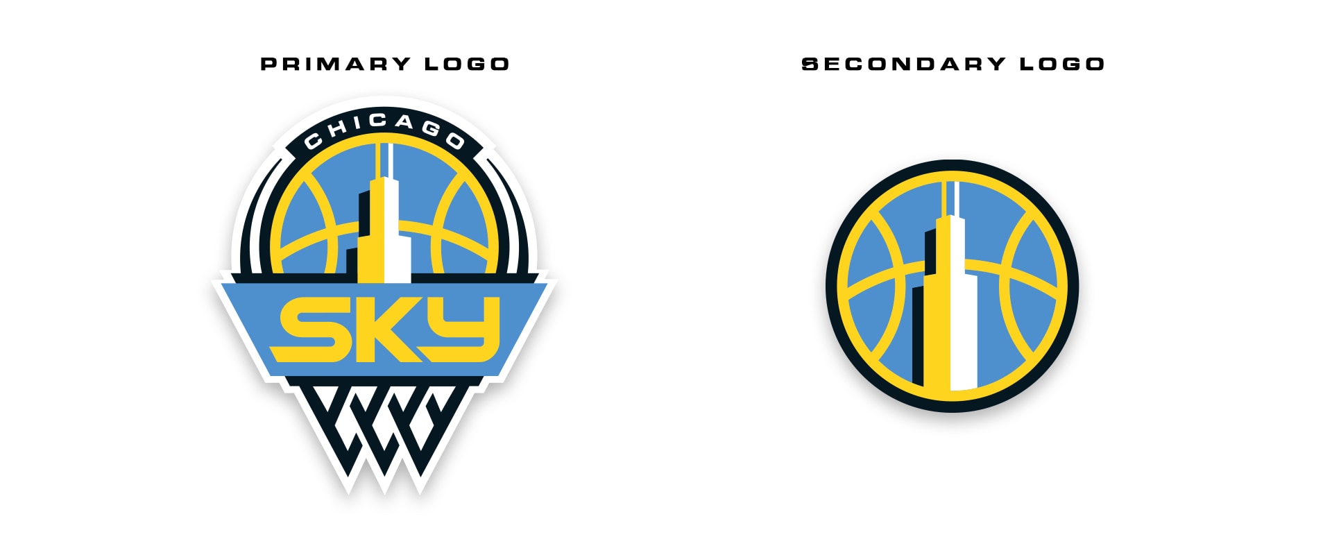
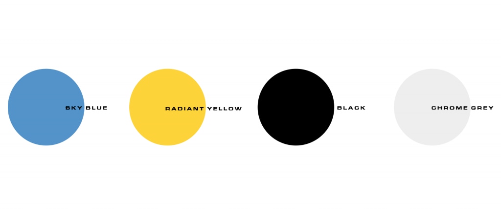
Crafted over a course of a year-long design process in collaboration with creative agency David Day Associates, both the primary and secondary logos pay tribute to the city of Chicago. The revamped branding elements introduce the colors black and grey to complement the Sky’s iconic blue and yellow tones, for a sleek, bold, and contemporary look.
“With the team’s move back to the city last season, it was the right timing for us to welcome in a new era of the Sky logo and brand,” Fox said of the team’s first logo change in its 12-year history.
The Sky recently finished its first season on their new home court of Wintrust Arena, located in the heart of the South Loop. Chicago holds the No. 4 overall pick of the 2019 WNBA Draft in April.
It's now the beginning of a new era.#skytown pic.twitter.com/hK6Q4p9nC7
— Chicago Sky (@chicagosky) November 7, 2018
“We have a roster full of very strong, athletic, young players who are going to be led and supported by some of the most talented veterans in the league,” Fox continued. “It is truly an outstanding blend of talent. This new logo symbolizes the excitement we have for the future success of this franchise.”
A new court design, as well as merchandise and apparel will be revealed in the months to come.
